

Pick a style template
Every bundle type comes with ready-made looks. You pick one, and you can still change any setting afterwards.
When you create a bundle: pick a type. The editor opens with that type’s default look. Open Style and click Change style to pick another.
For an existing bundle: open the bundle, open Style, and click Change style. Choose a look and click Apply. If you had changed the bundle’s layout, colours, corner radius, font or badges, a window lists those settings first, because the style replaces them. Your text, products and offers never change.
Match my theme: select Match my theme in the gallery to use your theme’s font and button style instead of the template’s colours.
Your saved templates appear in the same gallery under My templates.
Bundles you created before style templates existed use Classic and look exactly as before.
Set your global design
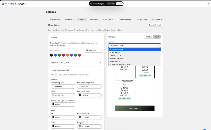
1. Open the Design tab Go to Settings → Design. The left side has your settings. The right side shows a live preview.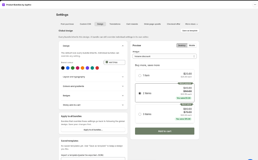
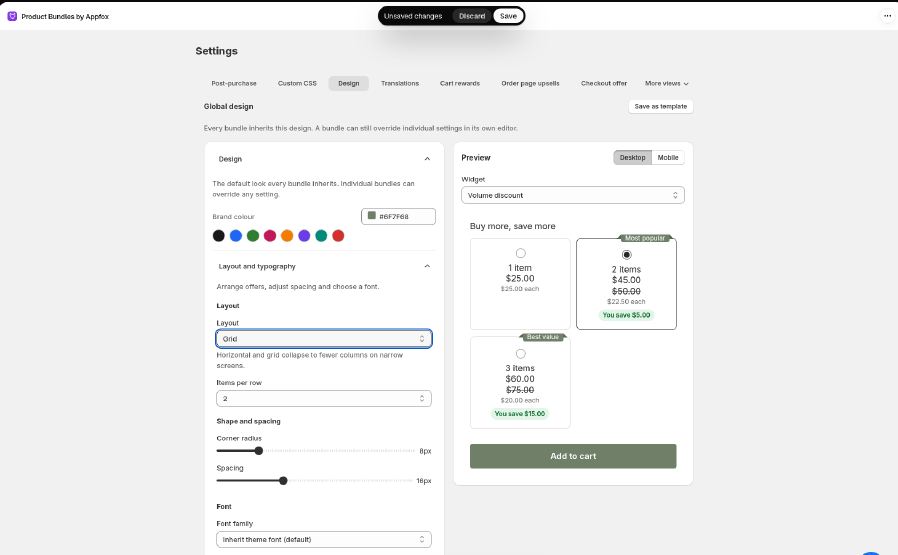
- Layout: Vertical (default), Horizontal, Grid, or Plain (no borders). For Grid, also choose Items per row (2, 3, or 4).
- Corner radius and Spacing: how rounded the cards are and how much space sits between them.
- Font family: keep Inherit theme font to match your store, or pick your theme’s body or heading font, System sans-serif, Serif, Monospace, or Rounded.
Style your bundle title
Open Bundle title to change the heading above your offers. Choose a Bundle title color with the color picker, a font, a size from 12–64 px, a weight, left/center/right alignment, normal or italic style, and letter case. These settings leave product names and offer labels unchanged. You see changes in the live preview as you edit. Theme fonts use your storefront’s theme font variables; the admin preview uses its available fallback fonts. Save to apply your changes. Use Reset bundle title to restore widget defaults, or Use global bundle title in a bundle editor to inherit your global title settings again. 4. Fine-tune colours Open Colours and gradients to set colours for cards, text, buttons, and the selected offer. Buttons and selected offers can use a gradient: set From, To, and Angle.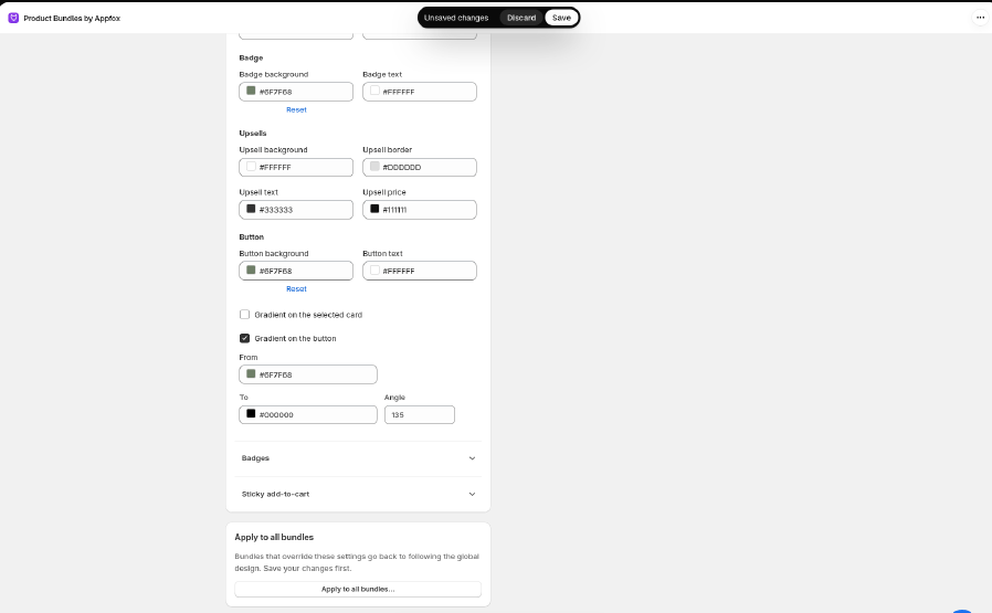
{{saved_total}} and {{saved_percent}}, and an empty subtitle shows nothing.
Open Savings and choose a Savings position: Under the price (the default for existing bundles) or Next to the tier title, which shows the savings as a pill beside the title. Savings style switches between a brand-coloured pill and a neutral grey chip. You can change the colours under Colours and gradients.
7. Make the selected tier easier to spot (optional)
Open Tier cards to change how quantity-break tiers look. Radio style is Browser default (the default for existing bundles) or Filled, which draws the radio in your accent colour and gives the selected tier a 2px outline. Select Dim tiers that are not selected to fade the other tiers until a shopper hovers over them or tabs to them. The Quantity breaks templates and the Bold cards and Minimal outline styles start with the filled radio.
8. Choose where add-ons show (optional)
Open Add-ons and choose an Add-on placement: Below the offers (the default for existing bundles) or Inside the selected tier. Inside the selected tier, checkbox add-ons and personalisation fields sit in the card of the tier your shopper picks, with a thumbnail, the price and the crossed-out original price. Their choices stay when the shopper switches tier. Widgets without tier cards, such as fixed bundles, keep add-ons below the offers. The Bundle + add-on template starts with this placement.
9. Turn on the sticky add-to-cart bar (optional)
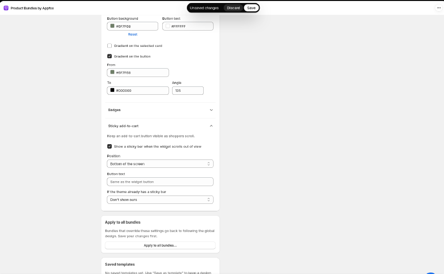
Open Sticky add-to-cart and select Show a sticky bar when the widget scrolls out of view. Then choose:
- Position: bottom or top of the screen.
- Button text.
- If the theme already has a sticky bar: Don’t show ours, or Hide the theme’s and show ours.
Show bundles as one chooser
Open Bundle chooser and select Show bundles for this product as one chooser. On a product page, your shoppers then see one list: the product on its own, then each Fixed or Classic set that includes that product. One button adds the choice they pick. The product on its own is added at its normal price, with no bundle discount. Volume discounts, mix and match, and bundles with add-ons, personalisation, variant choices, or subscriptions stay as their own widgets. Leave the setting off and every bundle keeps its own widget, which is how existing shops look. The Bundle chooser style and the Product + accessory sets template show this list in the preview. The list appears on your storefront only when this setting is on.Give one bundle its own look
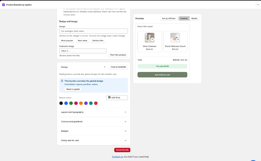
Every bundle uses the global design until you change something in that bundle.- Go to Bundles and open the bundle.
- Open Style. A banner shows Using the global design.
- Change any setting. The banner changes to This bundle overrides the global design and lists what’s different.
- Click Save.
Apply the global design to all bundles
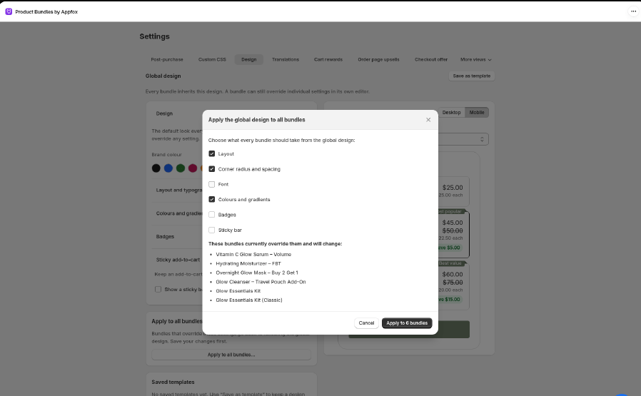
If you’ve changed bundles one by one and want them all to match again:- Save any changes on the Design tab first.
- Click Apply to all bundles….
- Choose what every bundle should take from the global design: Layout, Corner radius and spacing, Font, Colours and gradients, Badges, or Sticky bar.
- The window lists the bundles that will change. Click Apply to N bundles.
Save and reuse templates
A template is a saved design you can switch back to, or move to another store.- Save: click Save as template next to the Global design heading and give it a name.
- Use: under Saved templates, click Use as global design. This replaces your current global design, so save it as a template first if you want to keep it.
- Export: click Export to download the template as a JSON file.
- Import: paste an exported JSON into Import a template (paste the exported JSON) and click Import template.
- Delete: click Delete. Bundles that already use the design keep their look.
Good to know
- Widget text (button labels, titles) isn’t set here. Change it in Settings → Translations. See Supported languages.
- The cart banner and cart rewards bar use your global colours, spacing, corner radius, and font.
- For anything the Design tab can’t do, use Custom CSS.
- Your theme’s own CSS can sometimes win over these settings. If the storefront doesn’t match the preview, see Troubleshooting.